How TGL listening looks as as graph
I saw this when I looked at the analytics for TGL today.
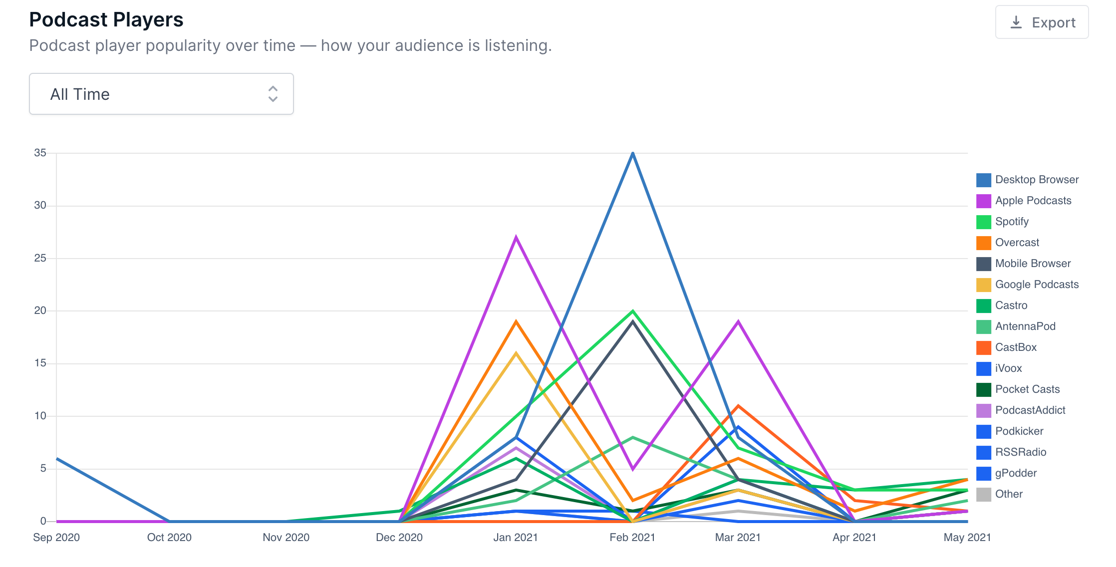
In Bebuaray of 2021 I used some of the episodes of TGL as supplemental material for a class I was teaching. I think that explains why the desktop browser heat so high during that month and then dropped a lot.
I'll be interested to see how the graph changes in the coming months.